
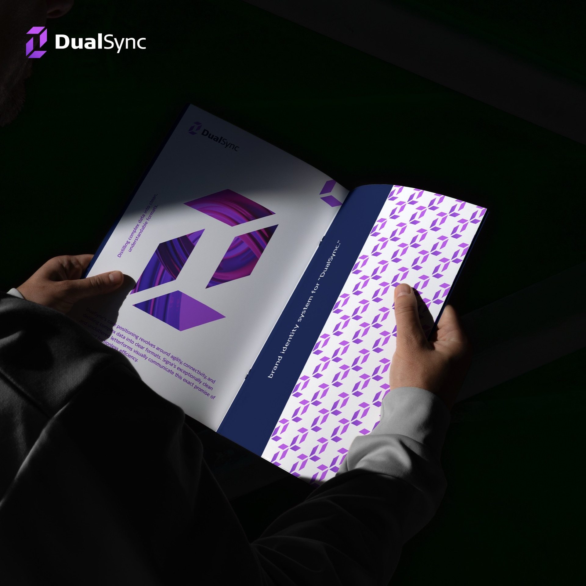
The project
The brief
The brief was an identity for DualSync, a company promising flawless integration and communication between systems: trustworthy, robust infrastructure. Its core positioning is agility, connectivity, and distilling complex data into clean, understandable formats. The identity had to make that promise visible.
A monogram built on a grid
The geometric monogram is drawn on a strict construction grid, so its two halves read as one synchronised form. It works at app-icon size as well as on a building.
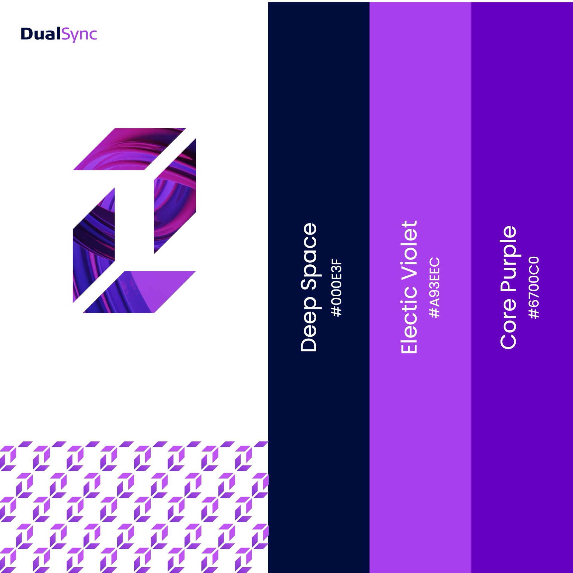
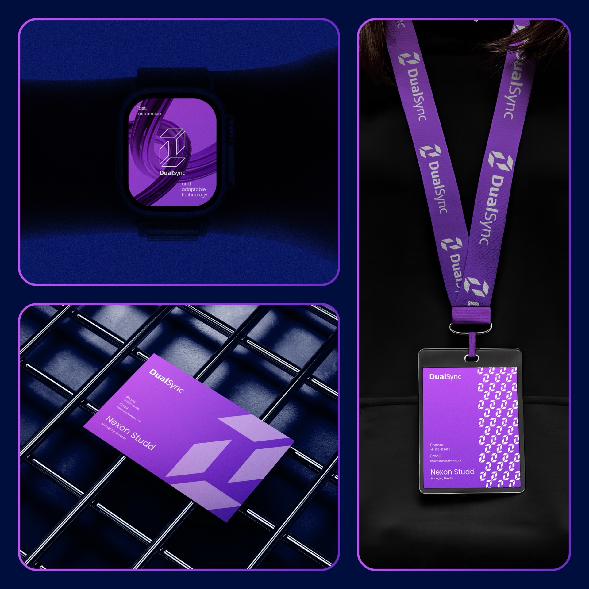
Repeated edge to edge, the monogram becomes a pattern of interlocking units, a direct picture of systems working in sync. The pattern carries the brand on surfaces where the logo would be too loud, from the inside of the brand book to backgrounds in the app.
Type and colour
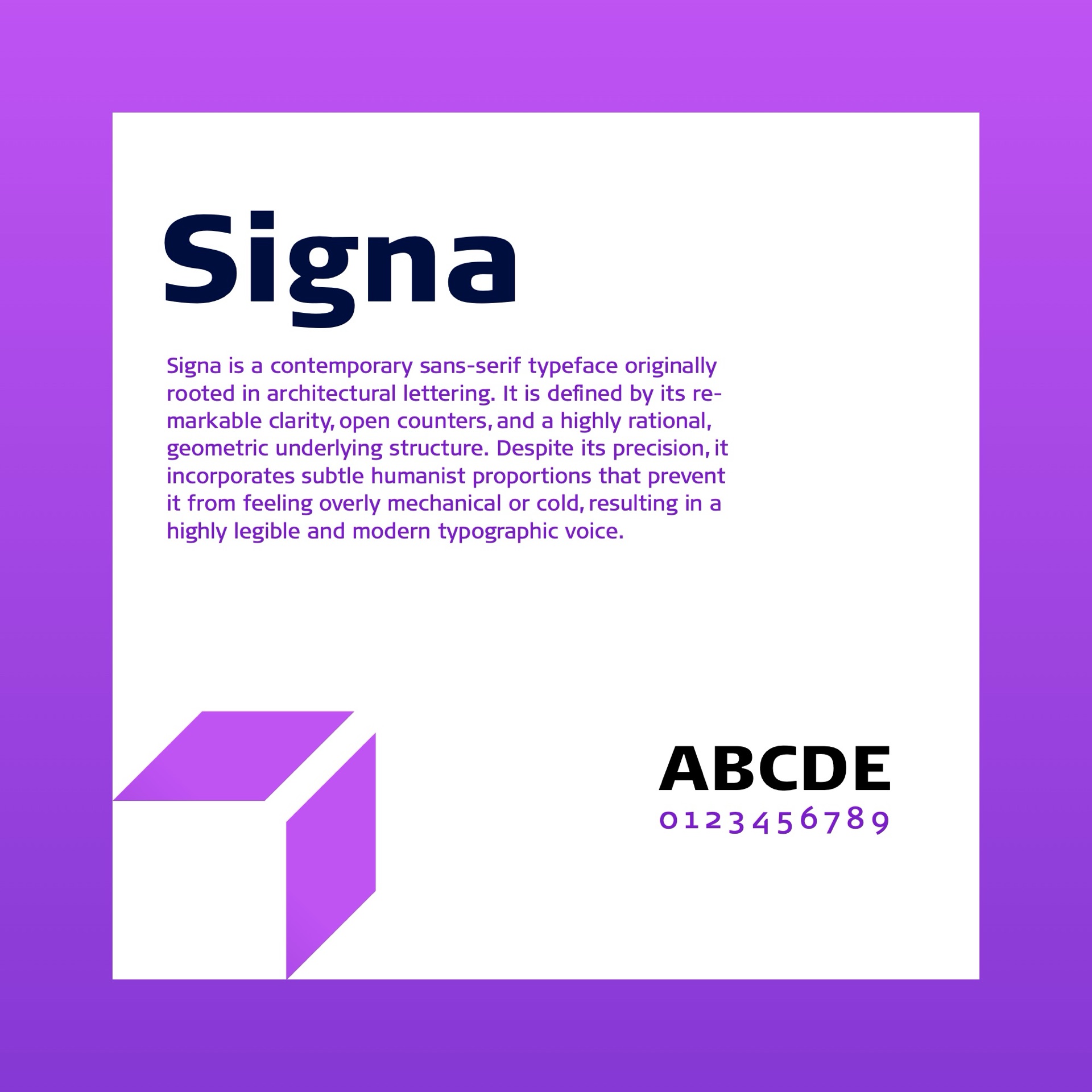
The typeface is Signa, a contemporary sans-serif rooted in architectural lettering. It has clear, open counters and a rational geometric structure, with subtle humanist proportions that stop it feeling cold. Its uncluttered letterforms say “frictionless efficiency” before a word is read.
The palette pairs Deep Space (#000E3F) with Electric Violet (#A93EEC) and Core Purple (#6700C0): a dark, stable ground with energetic accents.
Applications
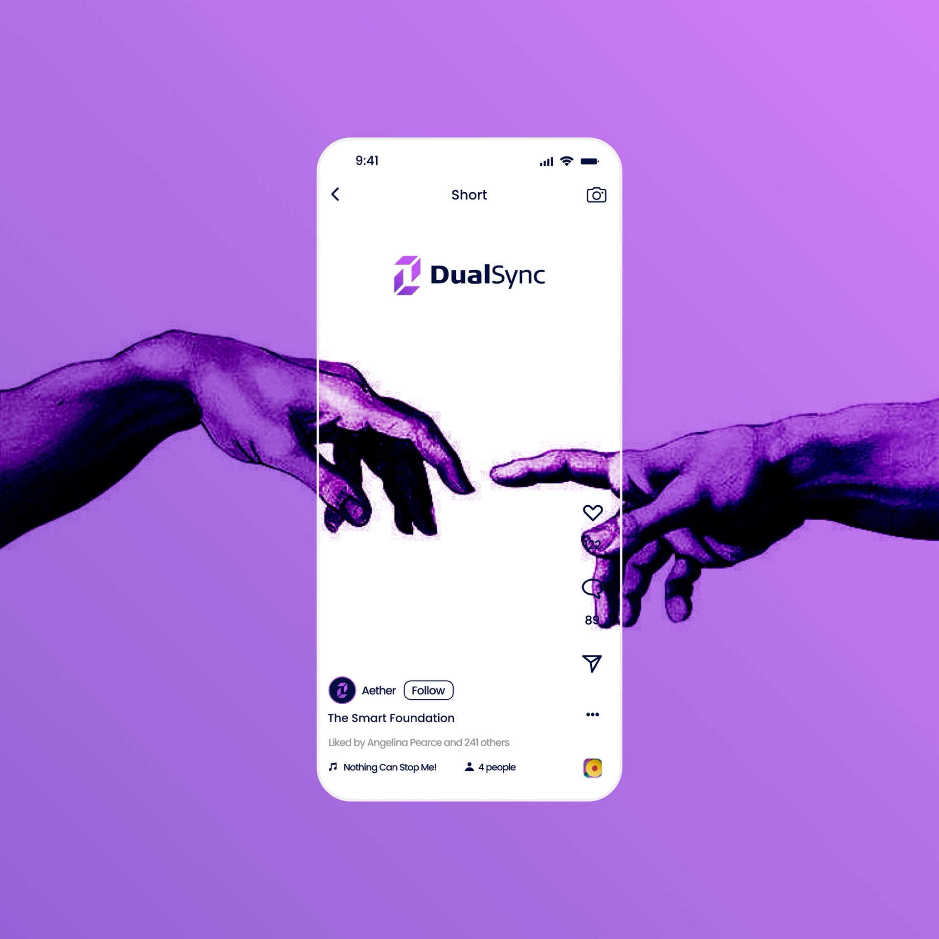
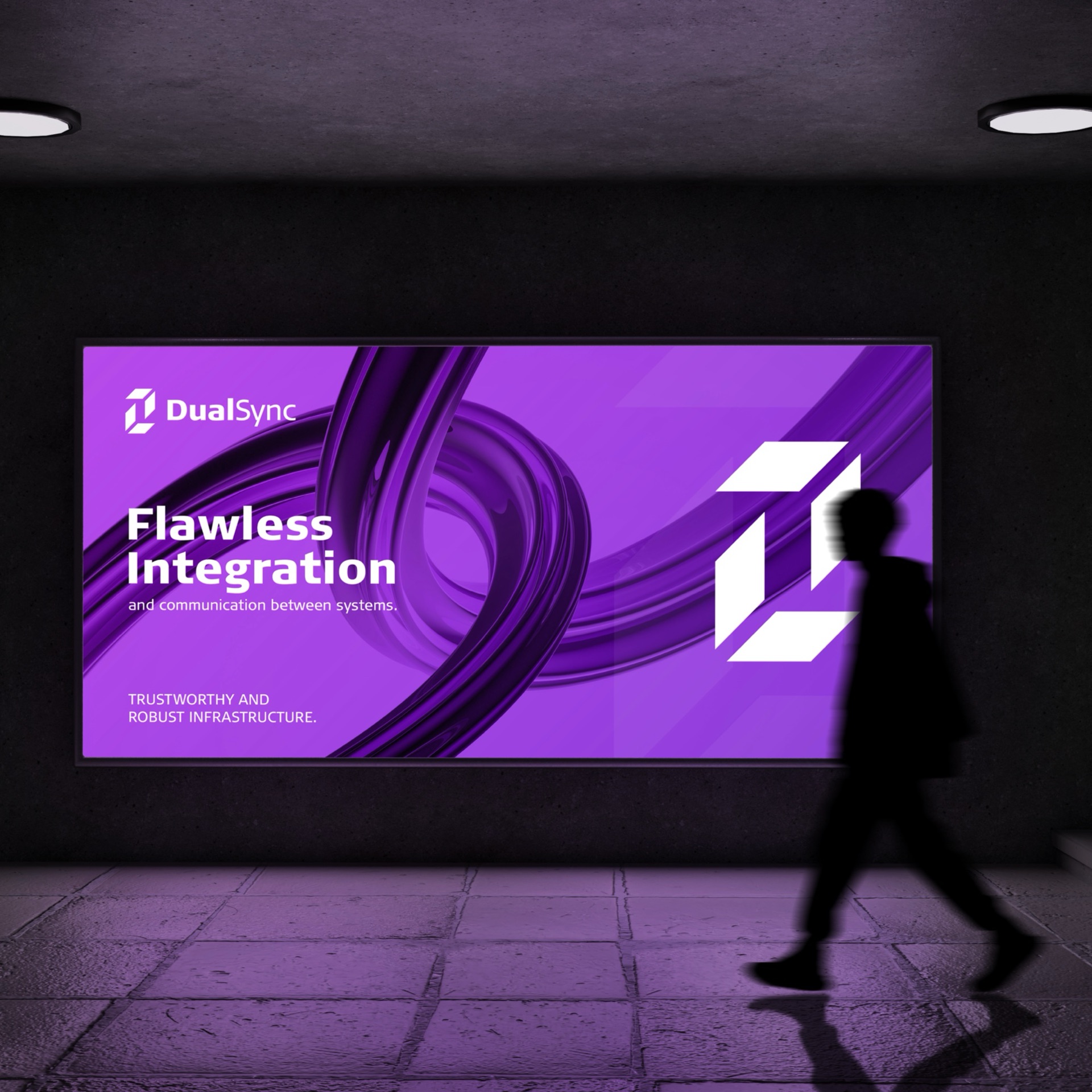
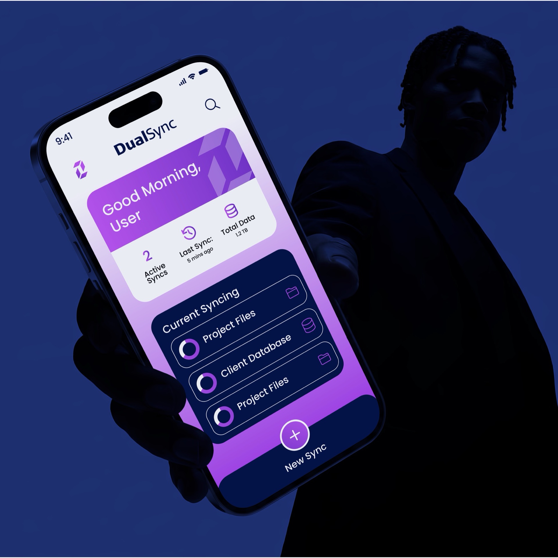
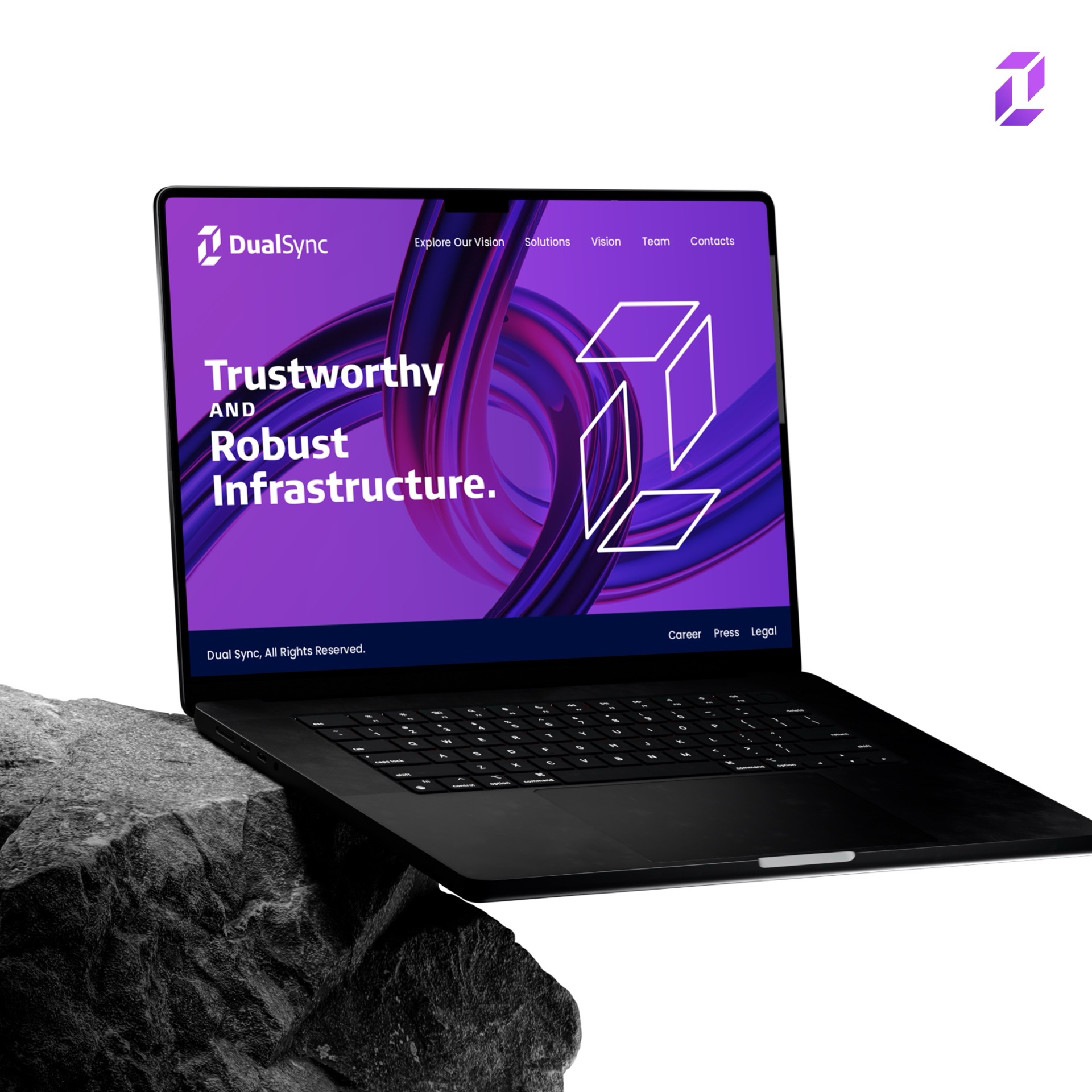
The system runs across the sync dashboard app, the website, out-of-home advertising, print, business cards and staff ID.
How we approach brand identity →Read: wordmark, monogram or symbol? →Start a project like this →