The project
The brief
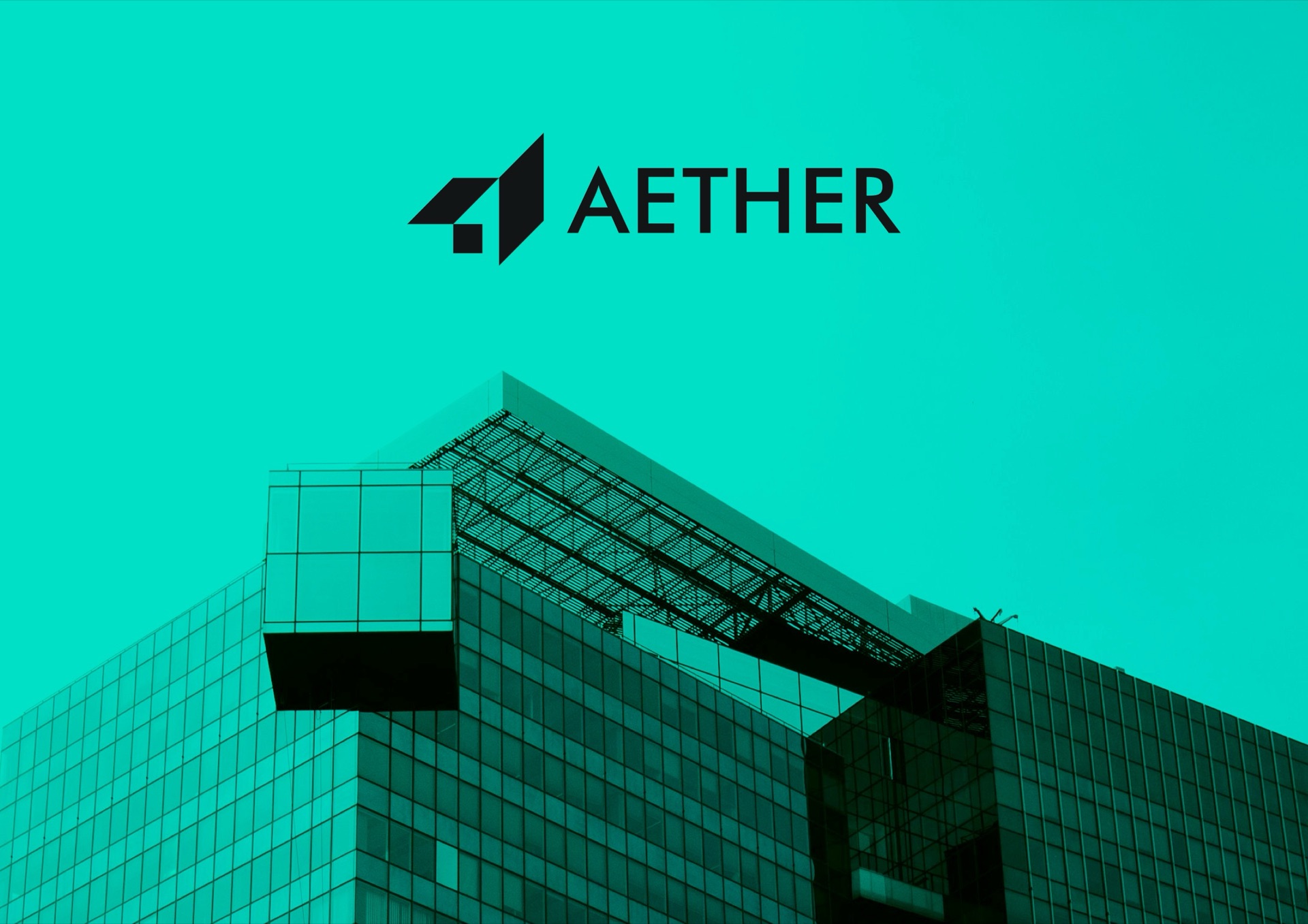
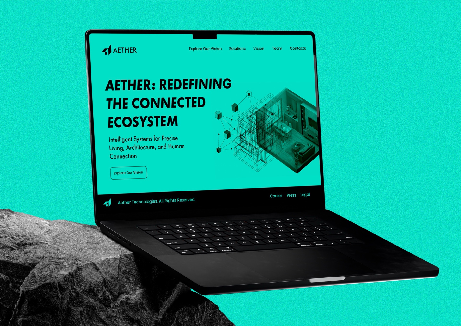
The brief was an identity for Aether, a company that builds intelligent systems for precise living, architecture and human connection. Its positioning line, “Redefining the connected ecosystem”, needed an identity that felt as engineered as the product: part technology company, part builder.
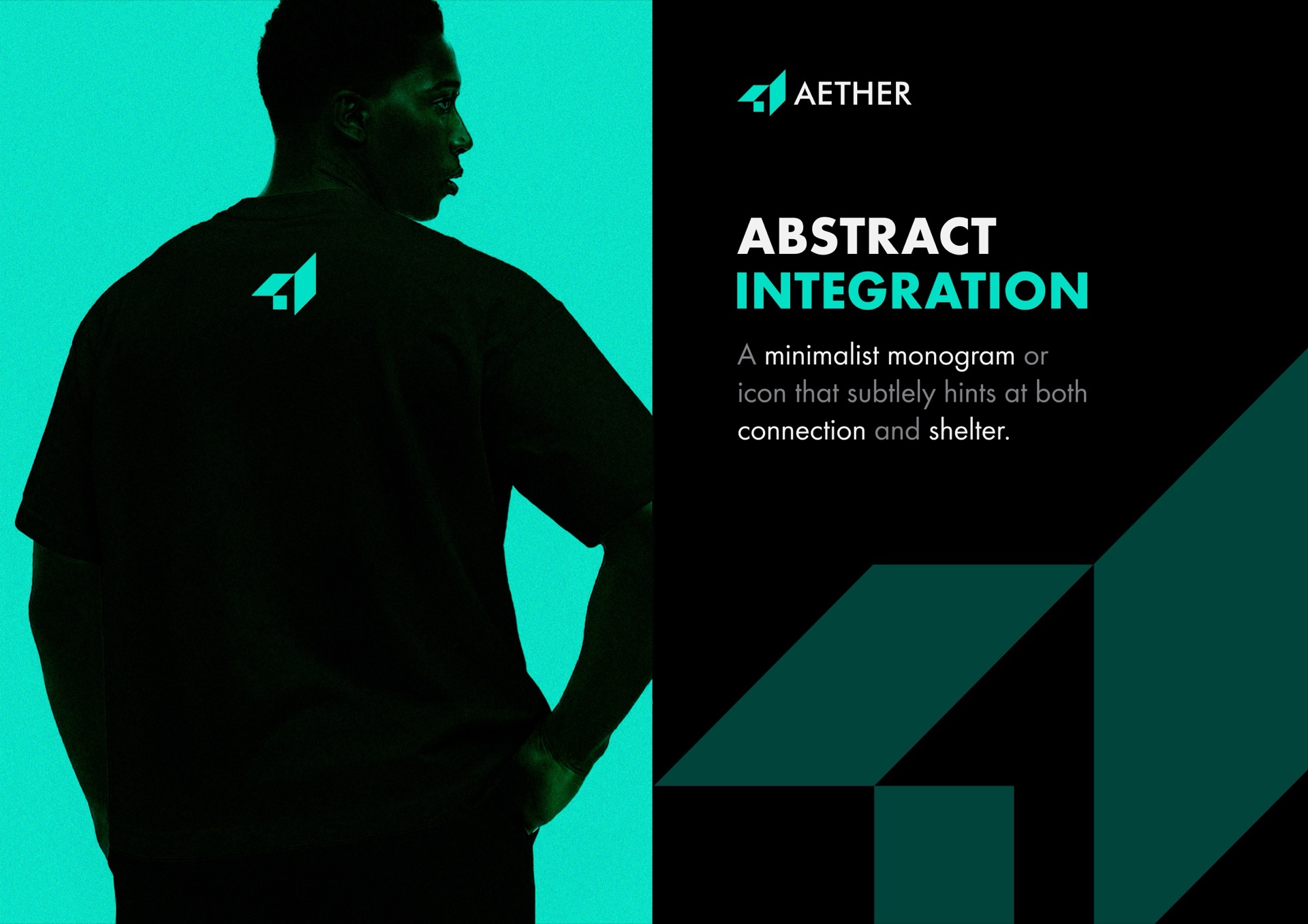
The idea: abstract integration
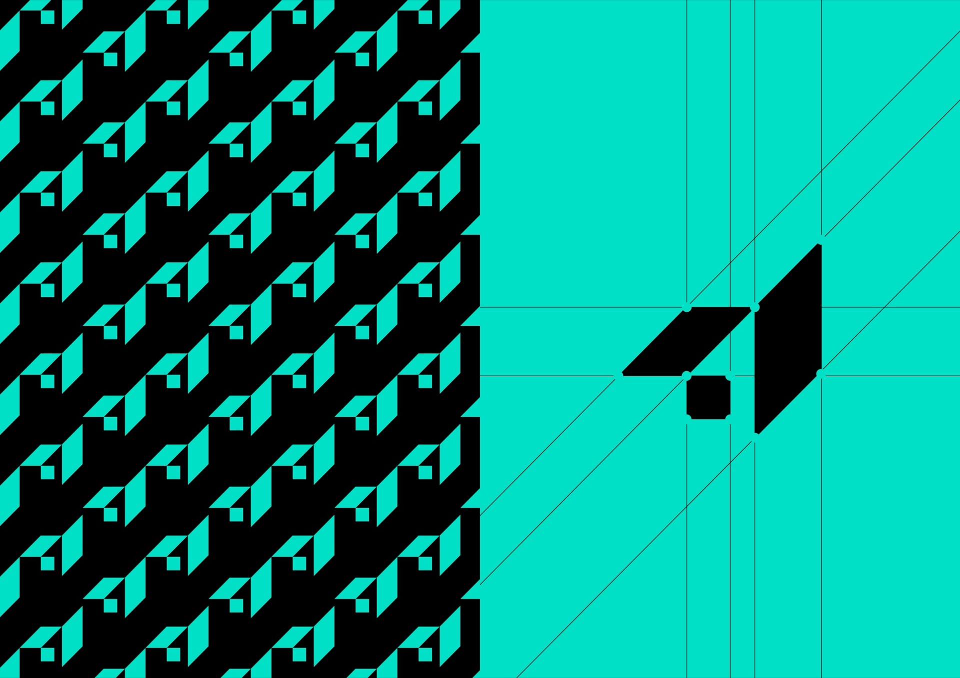
The monogram is deliberately minimal. Its form hints at two things at once: connection, two parts locking together, and shelter, a roof over a space. That double reading carries the brand’s promise without a literal house or circuit.
Geometric precision
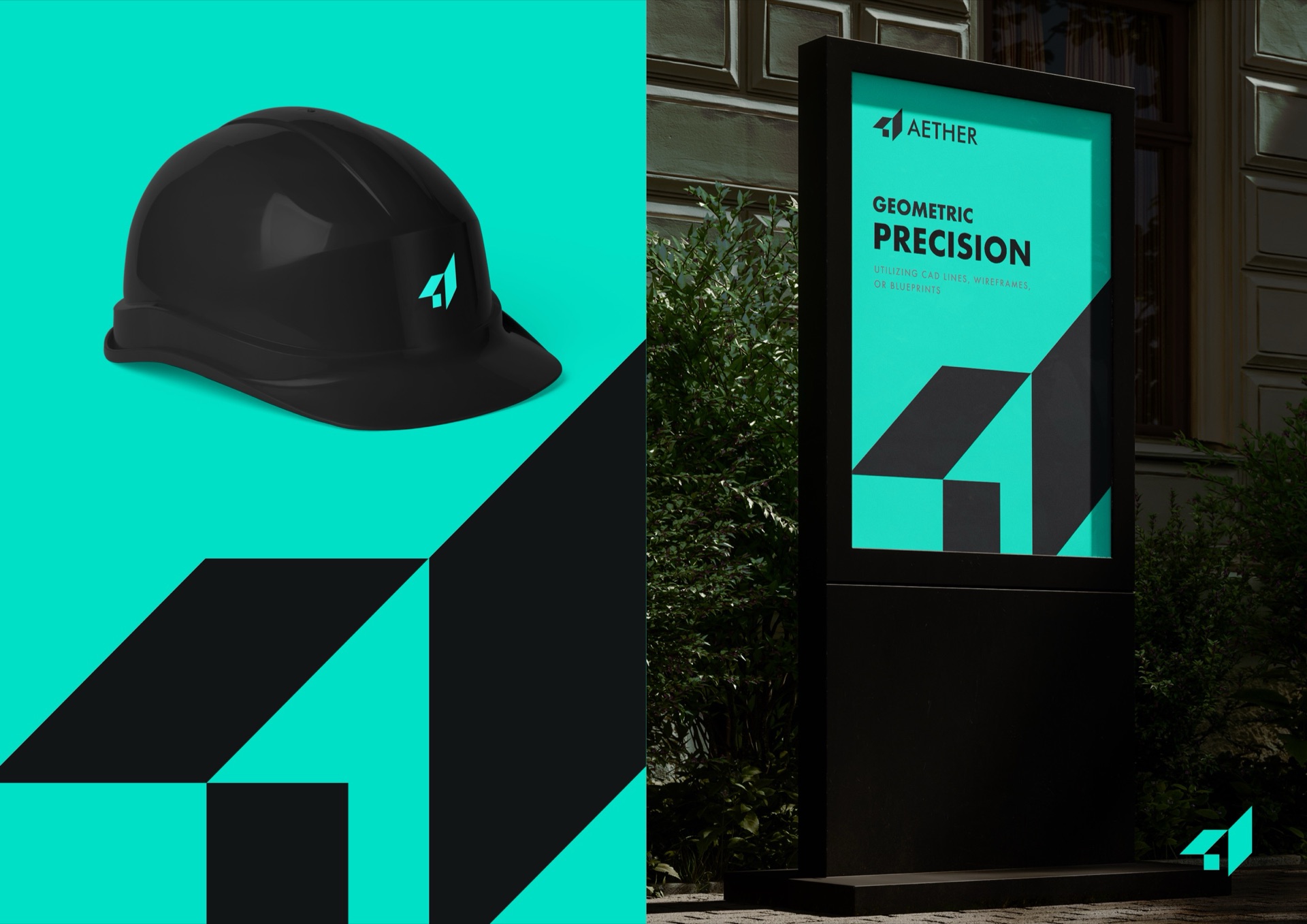
The supporting language borrows from the way buildings are drawn: CAD lines, wireframes and blueprints. Construction lines stay visible in parts of the system, so the identity looks measured rather than decorated, which is the same principle behind every Radius mark.
A single mint-and-black palette keeps everything quiet and technical. The monogram also repeats as a pattern for surfaces that need texture.
Where it lives
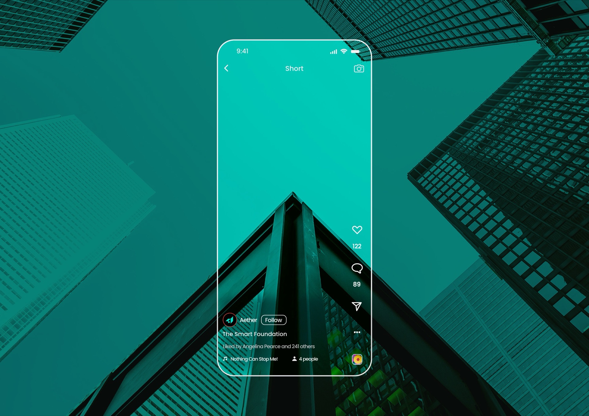
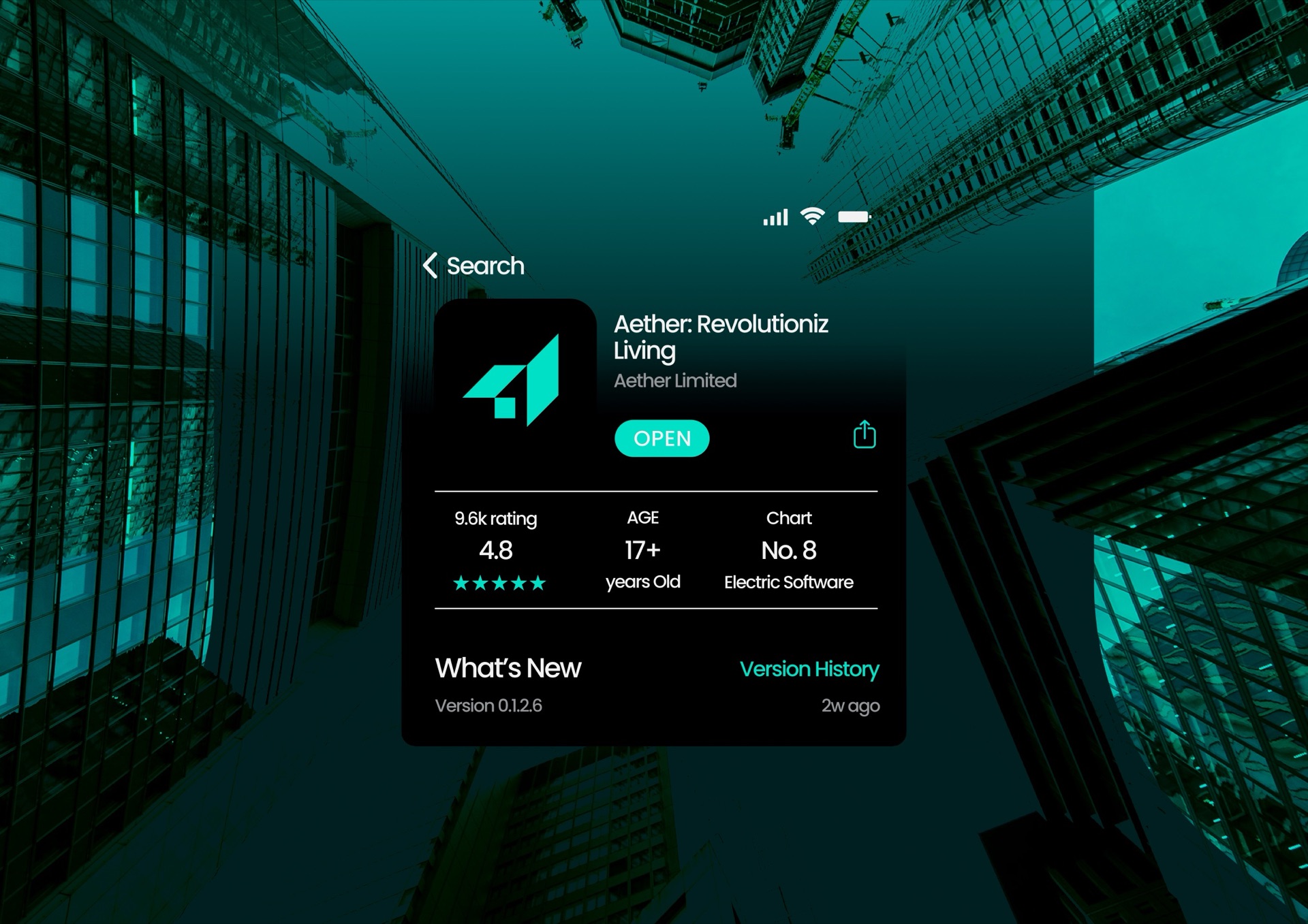
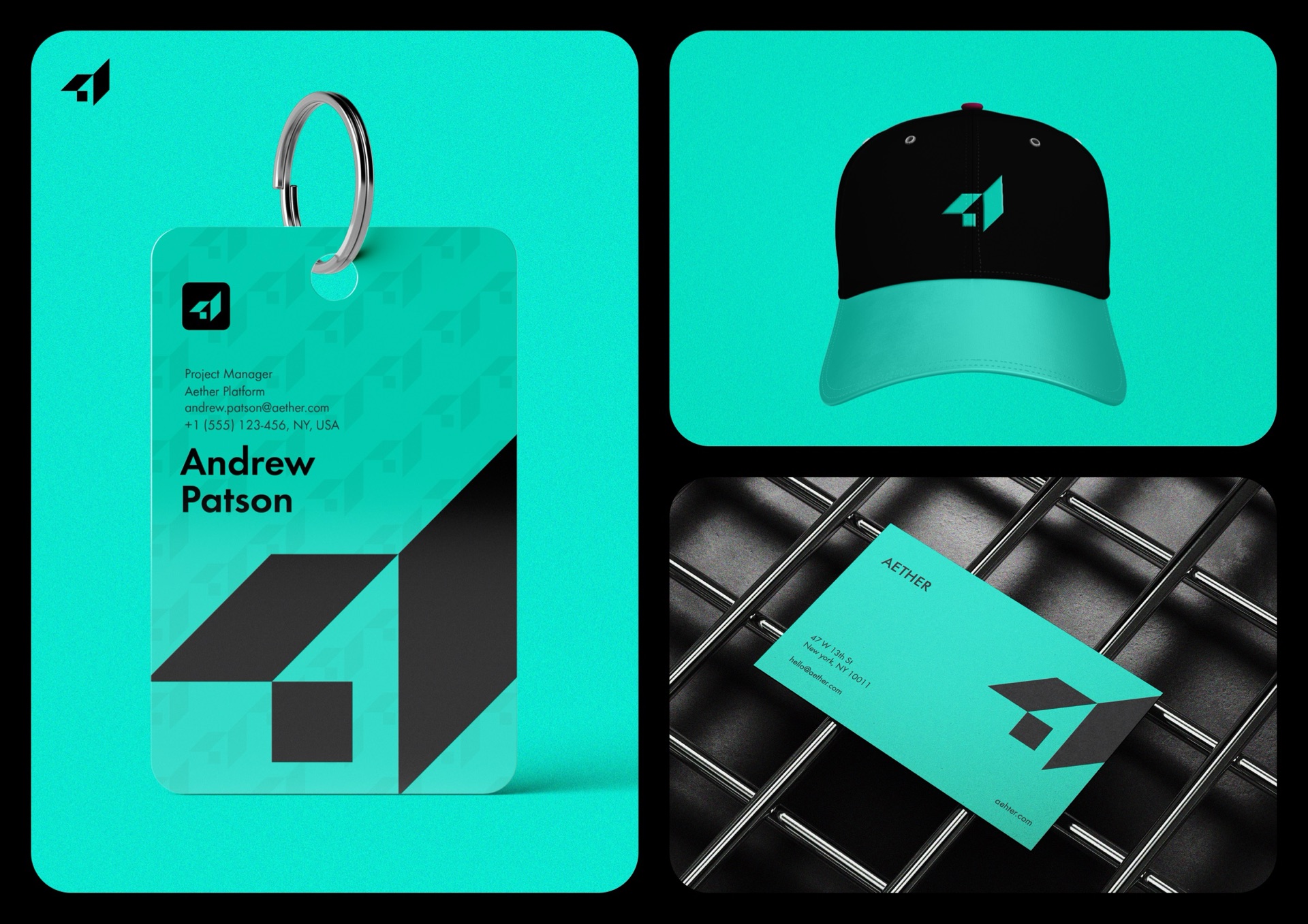
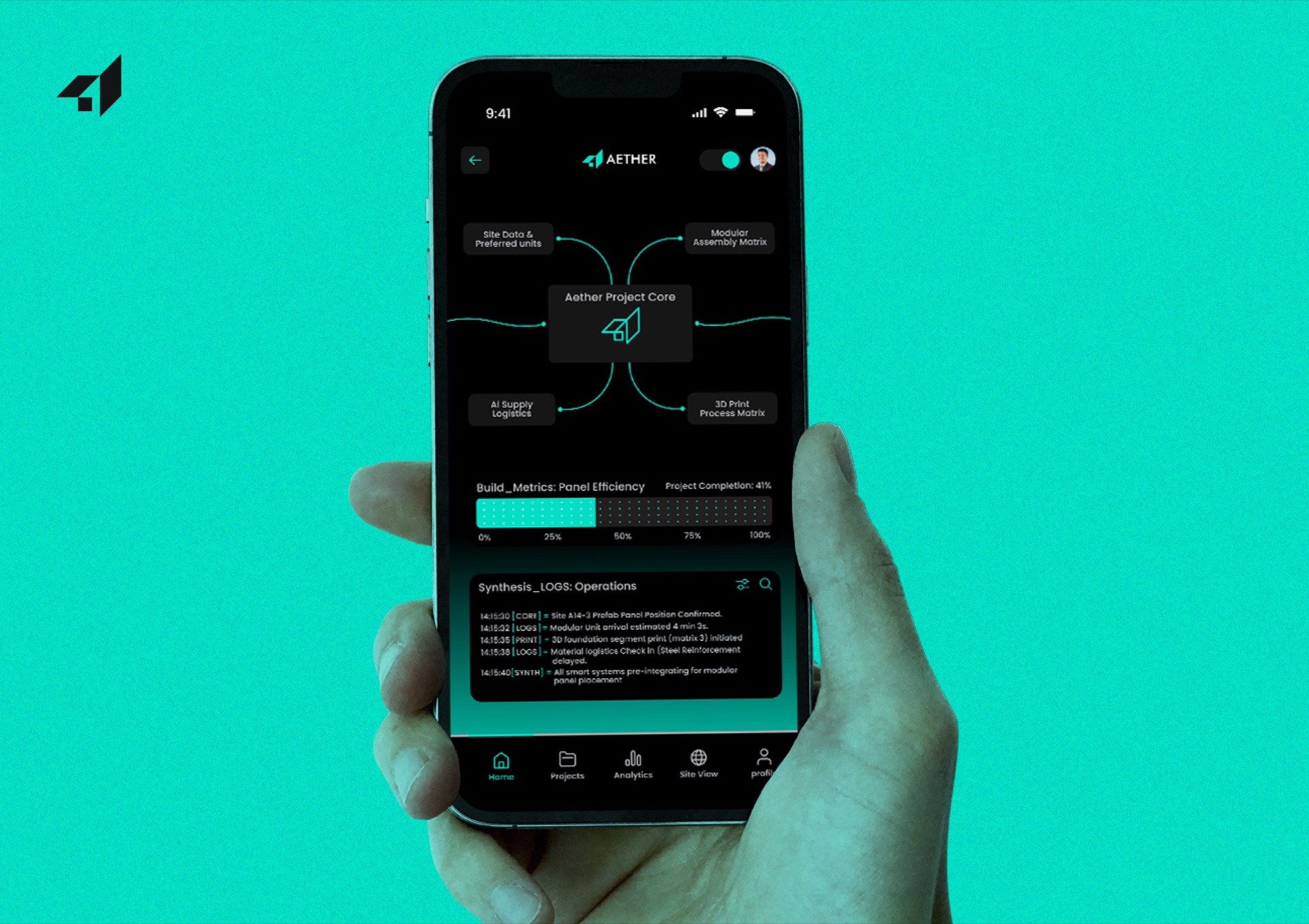
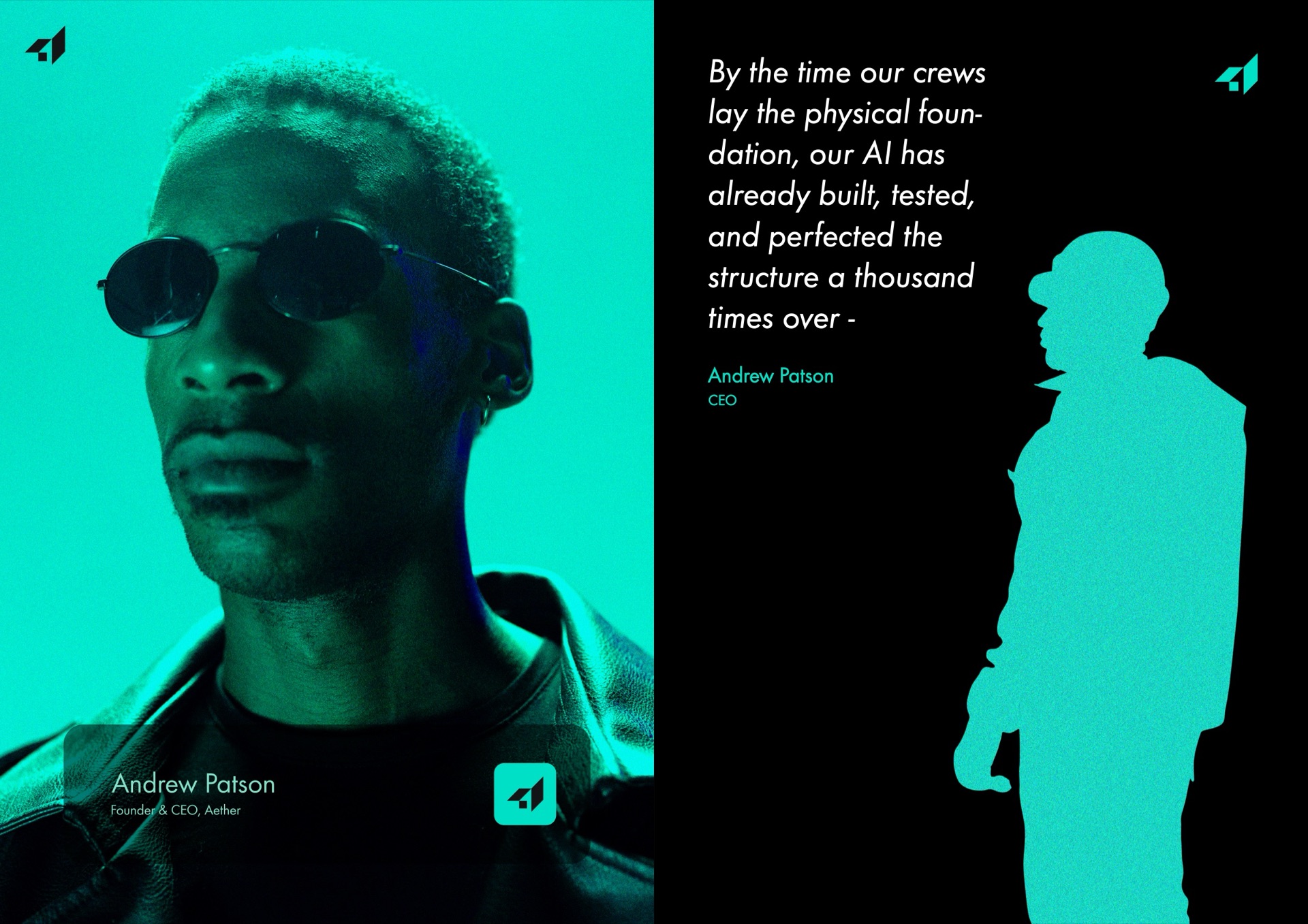
The identity runs across a social profile, an app store listing, a product dashboard for site and build data, the marketing website, business cards and stationery, site hardware, signage and merchandise.
How we approach brand identity →Read: wordmark, monogram or symbol? →Start a project like this →