
The project
The brief we set ourselves
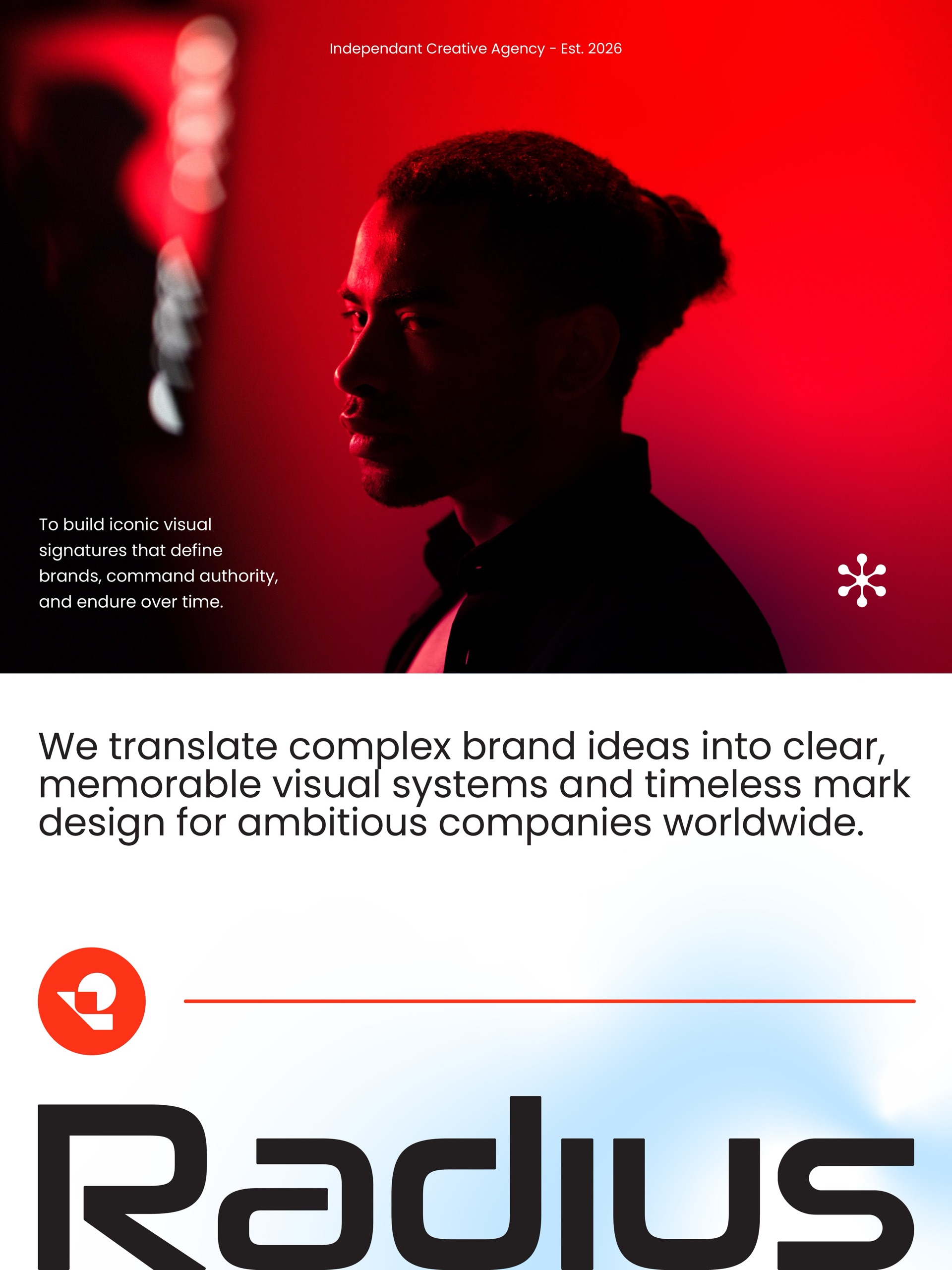
A studio that sells geometry has to show its own working. The Radius identity had to state the studio’s purpose, to build iconic visual signatures that define brands, command authority and endure over time, without a word of explanation.
The idea: a literal radius
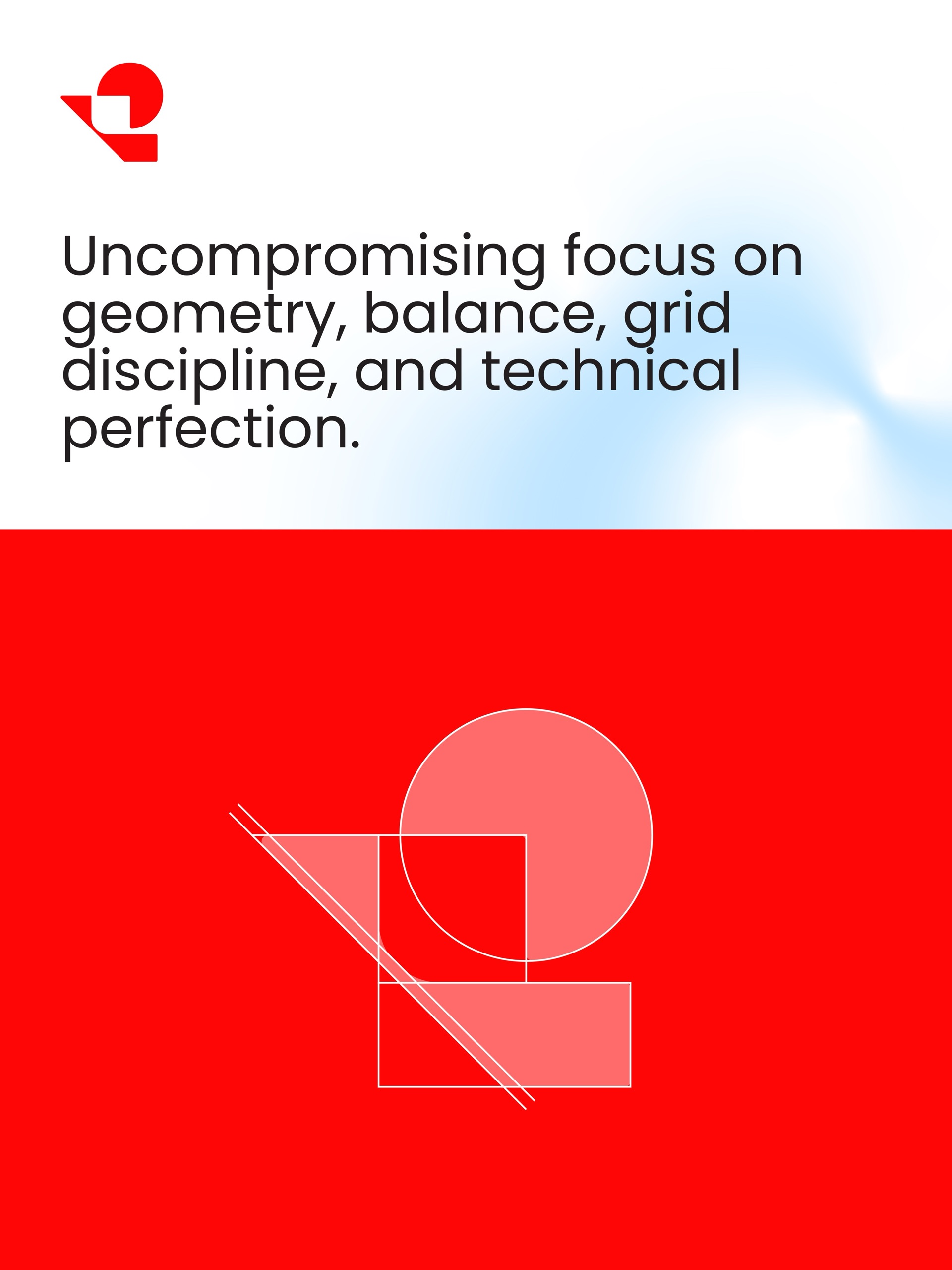
The mark is a circle with one quadrant notched out, which leaves the radius itself visible as an edge. It is locked to a 45° diagonal, and every surface of the system is built from those three shapes: the circle, the right angle and the diagonal.
The radius of the mark’s circle, 131.1 units, is the module everything else is measured in: spacing, type sizes and the grid on every board. That is why the same proportions repeat from the app icon to the poster.
Colour that serves the geometry
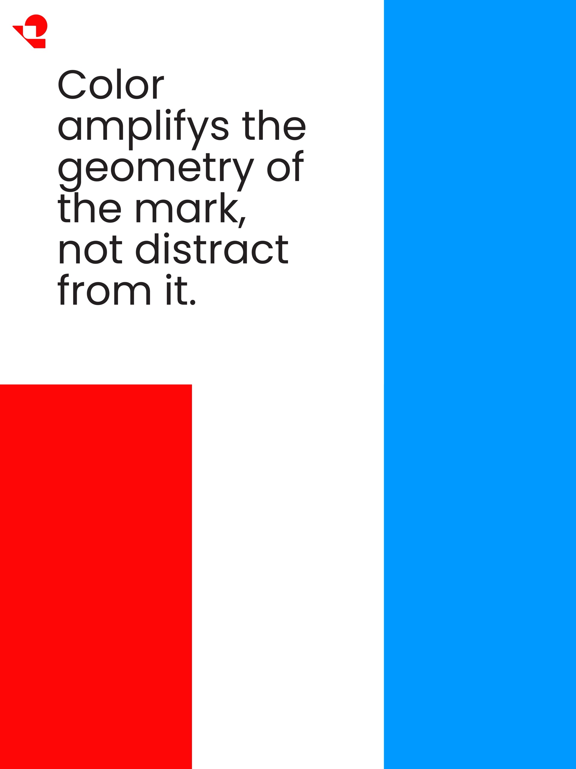
The system uses a single luminous accent, signal red, against white and near-black, with an icy blue as a secondary highlight. The rule written into the boards is simple: colour amplifies the geometry of the mark; it never distracts from it.
The system in use
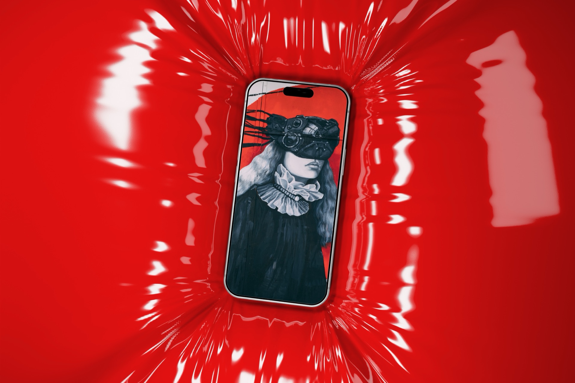
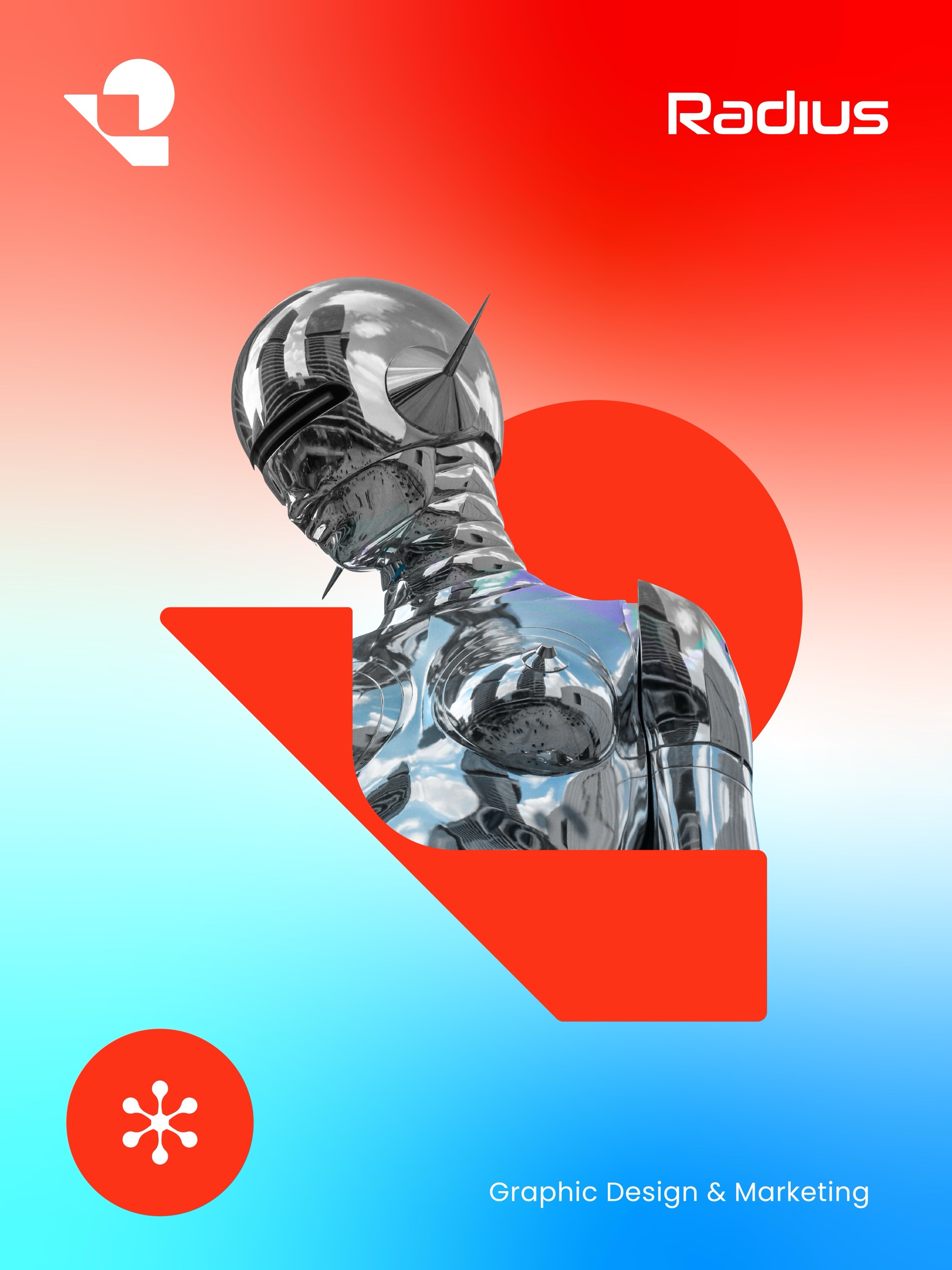
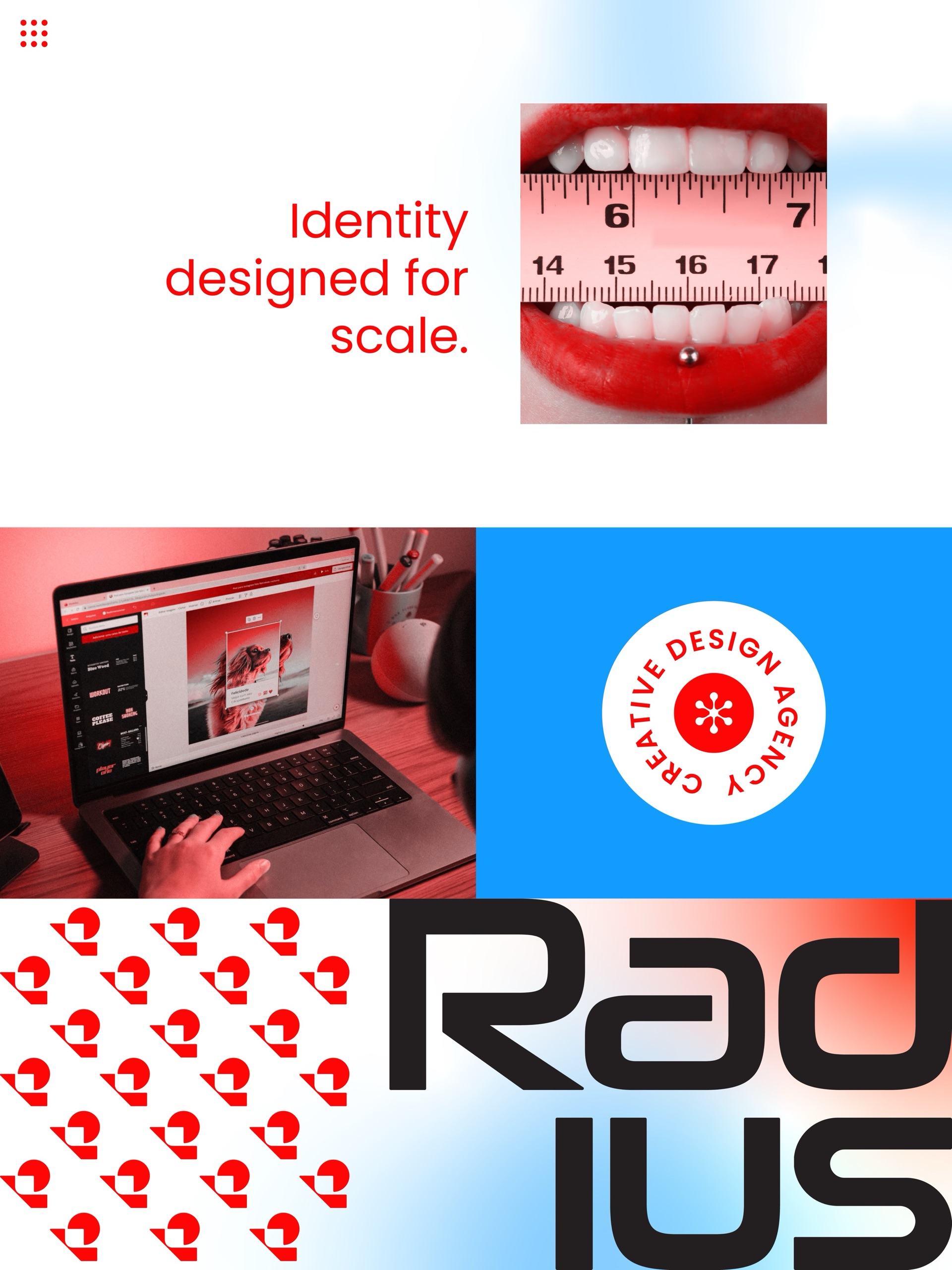
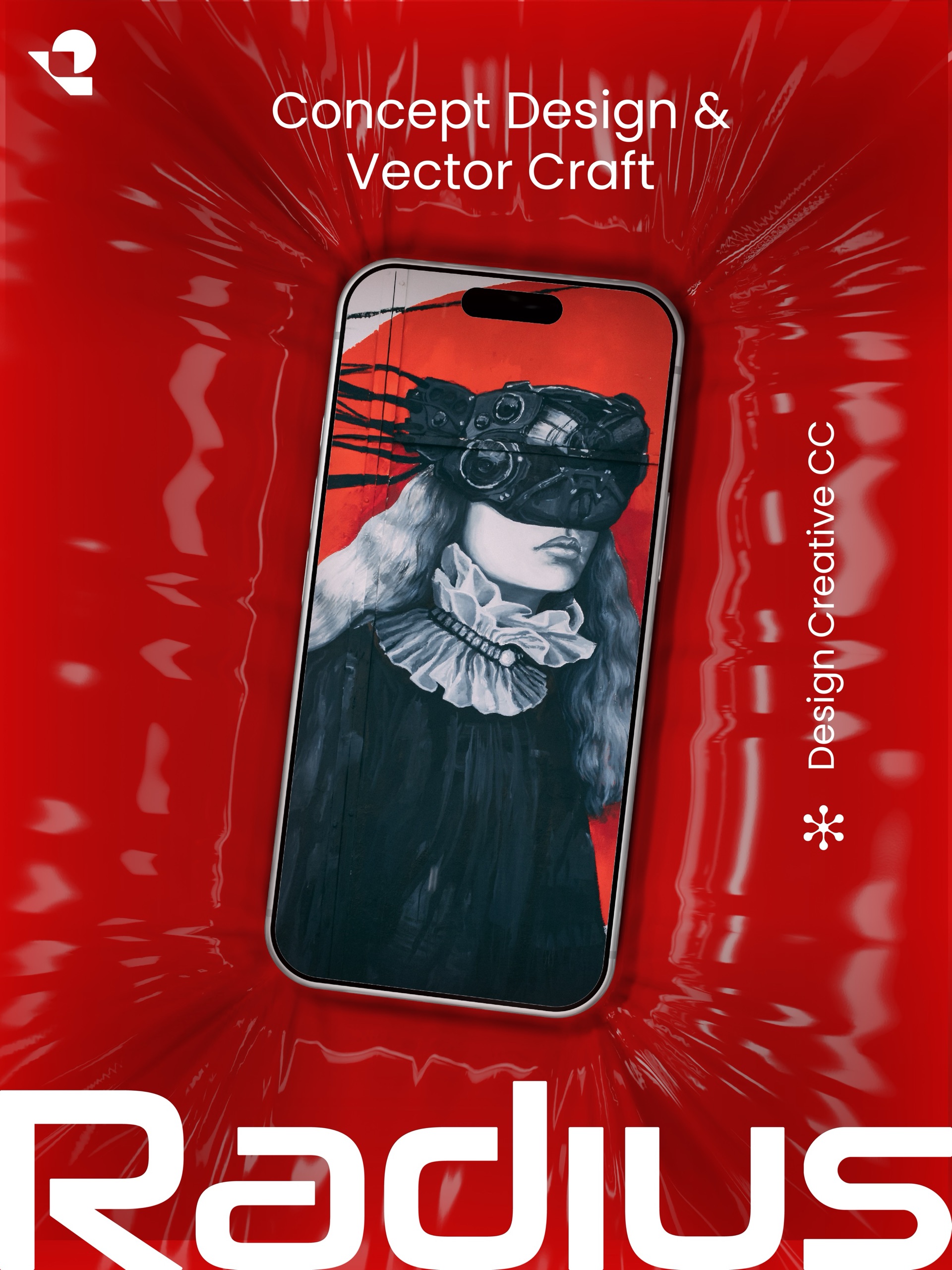
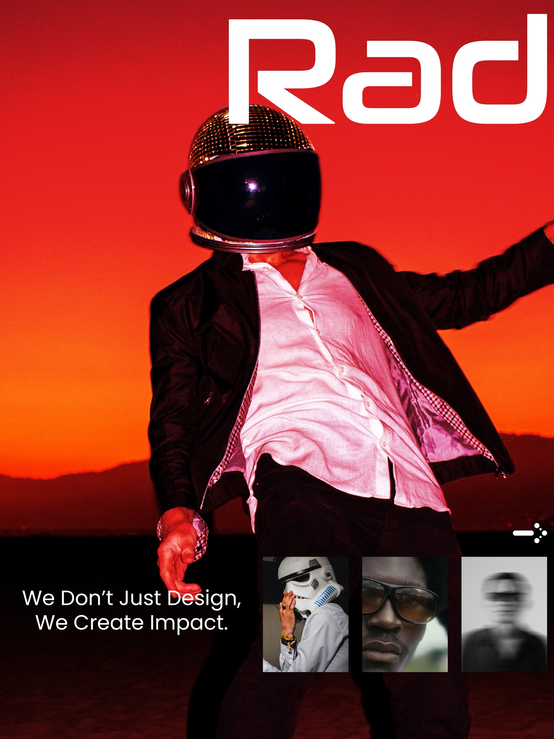
The boards carry the identity across a manifesto and wordmark, the mark’s construction, a colour system, pattern and badge, posters and applications, and an app screen. The same 45° cut became the transition on this website.
How we approach brand identity →Read: how we built the construction grid →Start a project like this →